Rewrite
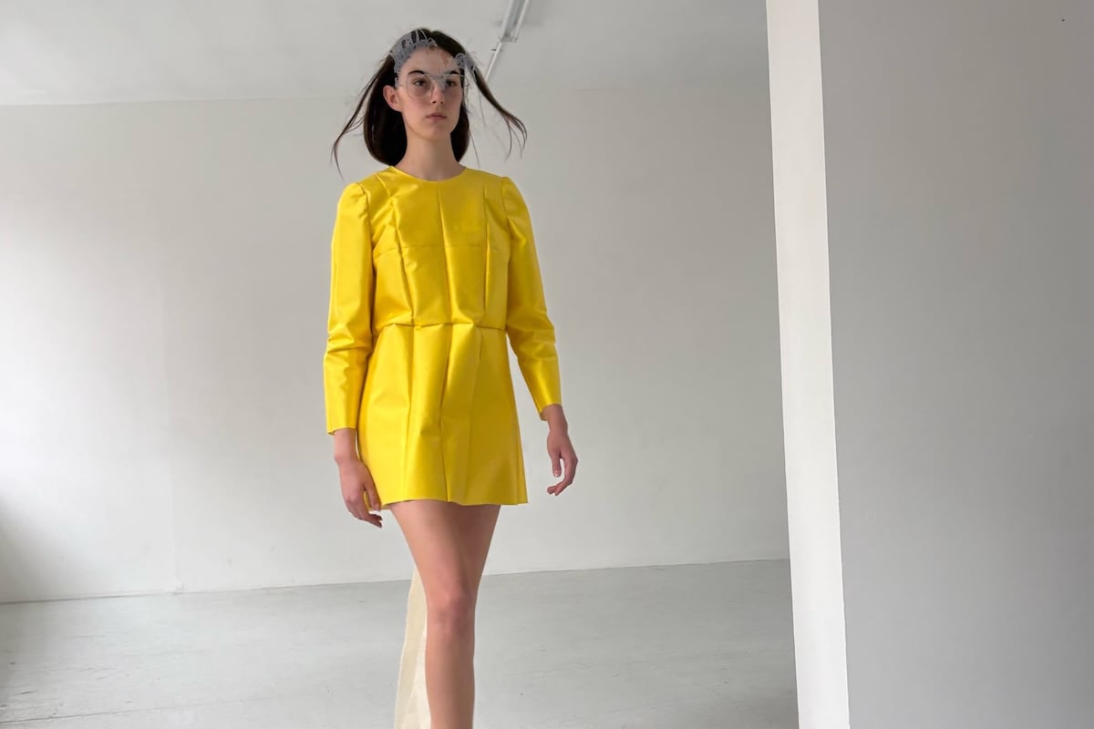
Lead ImageA Letter Spring/Summer 2027Courtesy of A Letter
Freddy Coomes and Matt Empringham aren’t biting off more than they can chew. The creative industries have long fetishised labour and all-nighters, surrounded by rails of unfinished clothes and interns fuelled on Redbull and cigarettes. Coomes and Empringham, who design the young London label A Letter, aren’t very interested in that mythology. Two days before their debut show, Coomes is upstairs at Sarabande, where the brand has its modest studio, talking to me through a webcam; Empringham, the quieter of the pair, is downstairs. “Matt’s in the thick of it,” Coomes says. He makes virtually all of A Letter’s clothes himself. There are no interns and no atelier of hands stitching through the night. But they’ve holidayed this summer and taken weekends off. “We’re really careful around jumping into things too quickly,” says Coomes, “building a big team and not being able to manage a big studio. We’re very happy with it being very personal right now.”
The pair has had plenty of time to figure out how to work together. They met aged 18 on the foundation course at Central Saint Martins, serendipitously paired for their very first project and became friends, effectively designing side by side ever since. During their placement years they briefly split geographically – Coomes interning at Loewe in Paris, Empringham at JW Anderson in London, both then under Jonathan Anderson – but continued making collections together in the time they could carve out around work. Even then their process was fast and with a no-brow approach to material, often beginning with cheap fabric, paper or rubber rather than a finished sketch and resulting in clothes that could look closer to propositions than conventionally resolved garments. That was part of their appeal.
A Letter has been stocked by Dover Street Market since launching in 2025, but the brand is still tiny, still partly supported by freelance work. The designers are figuring out what sort of brand it wants to become. Rather than disguise that with the theatre of overwork, they’ve worked within their limitations. Shown in the tiny, glaringly white Rose Easton gallery, five models cast by Julia Lange take turns walking two rotations, presumably buying time for the others to dash backstage and change. 27 looks walked. That’s your lot – no elaborate light show or army of models, no extravaganza, although the soundtrack was teeth-shatteringly loud. It’s suspiciously sensible for two designers deciding to hop onto the fashion hamster wheel.

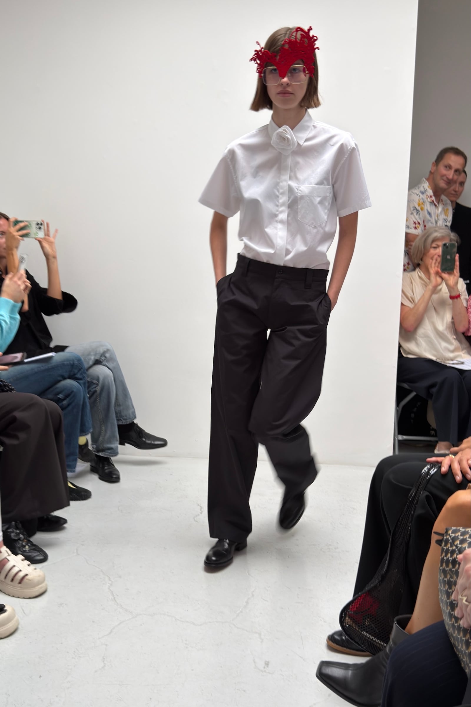
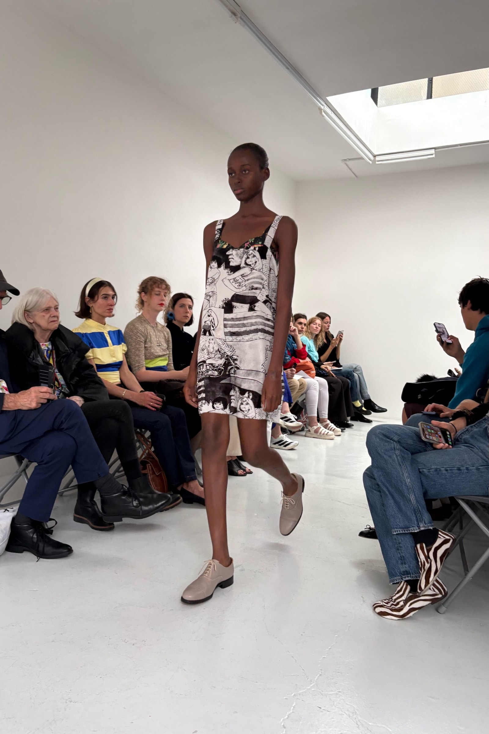
The clothes are a little more complicated. A Letter began this season with a pile of archetypal British stuff: a donkey jacket, a pair of vintage men’s chinos, a Ben Sherman gingham shirt, bits from St Michael. “The patterns were lifted basically one for one. Some of them we modernised and made more comfortable. We made them a bit bigger or made a bit smaller, but really the jackets are basically a direct pattern copy,” says Coomes. Tugging, altering and remaking them imperfectly, they carry the sentimental charge of those original pieces, “but there’s a bit of stiffness and there’s a bit of uneasiness,” Coomes says. “It’s not opulent and it’s not chic, sleek.” Hence the underwear with elastic zigzagged into place as if knocked up on somebody’s domestic sewing machine. Transparent dresses trail raw edges. A glossy silk dupion front suddenly gives way to a stripe of workaday calico running down the back. The gingham dress, worn with a matching shirt and fabric rose, picks up a Linda McCartney reference the pair first explored in a shoot over the summer. Then there’s PVC, electrostatic flocking, strange fabric treatments lurking beneath otherwise thoroughly normal-looking clothes. Colours are fresh and exciting.
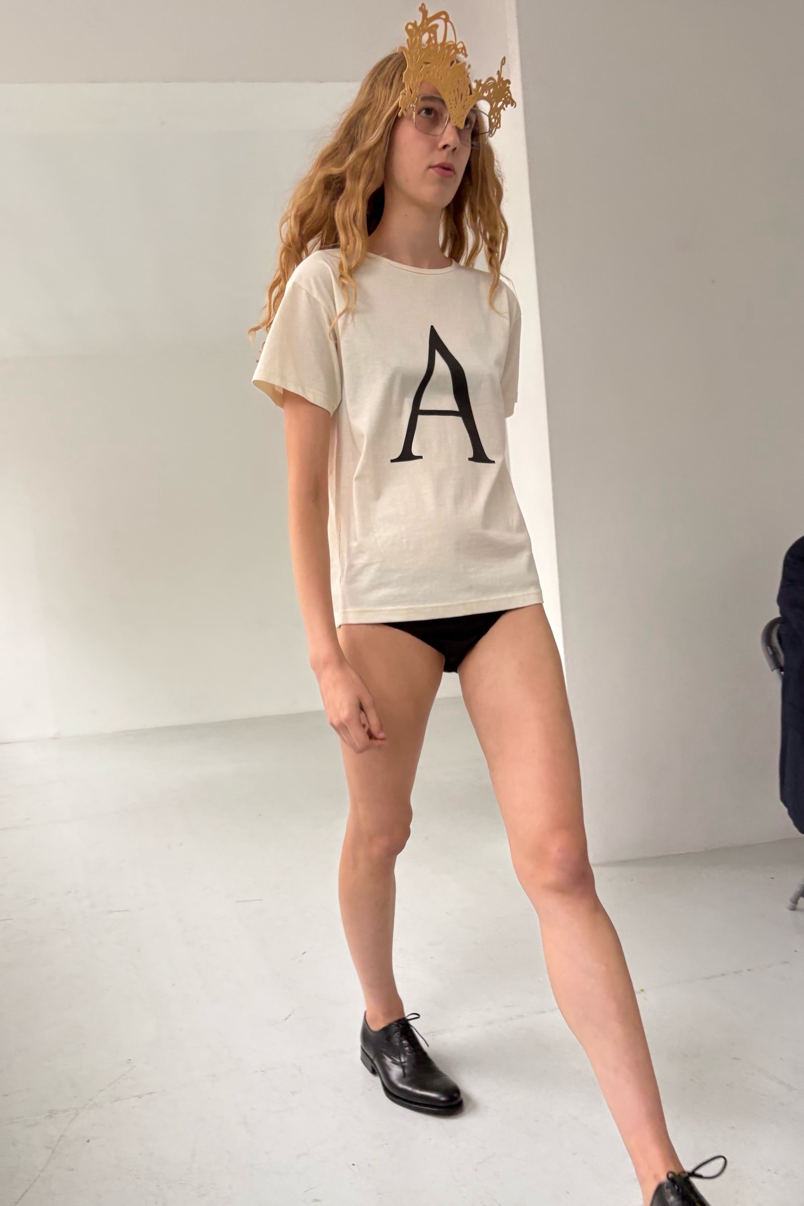
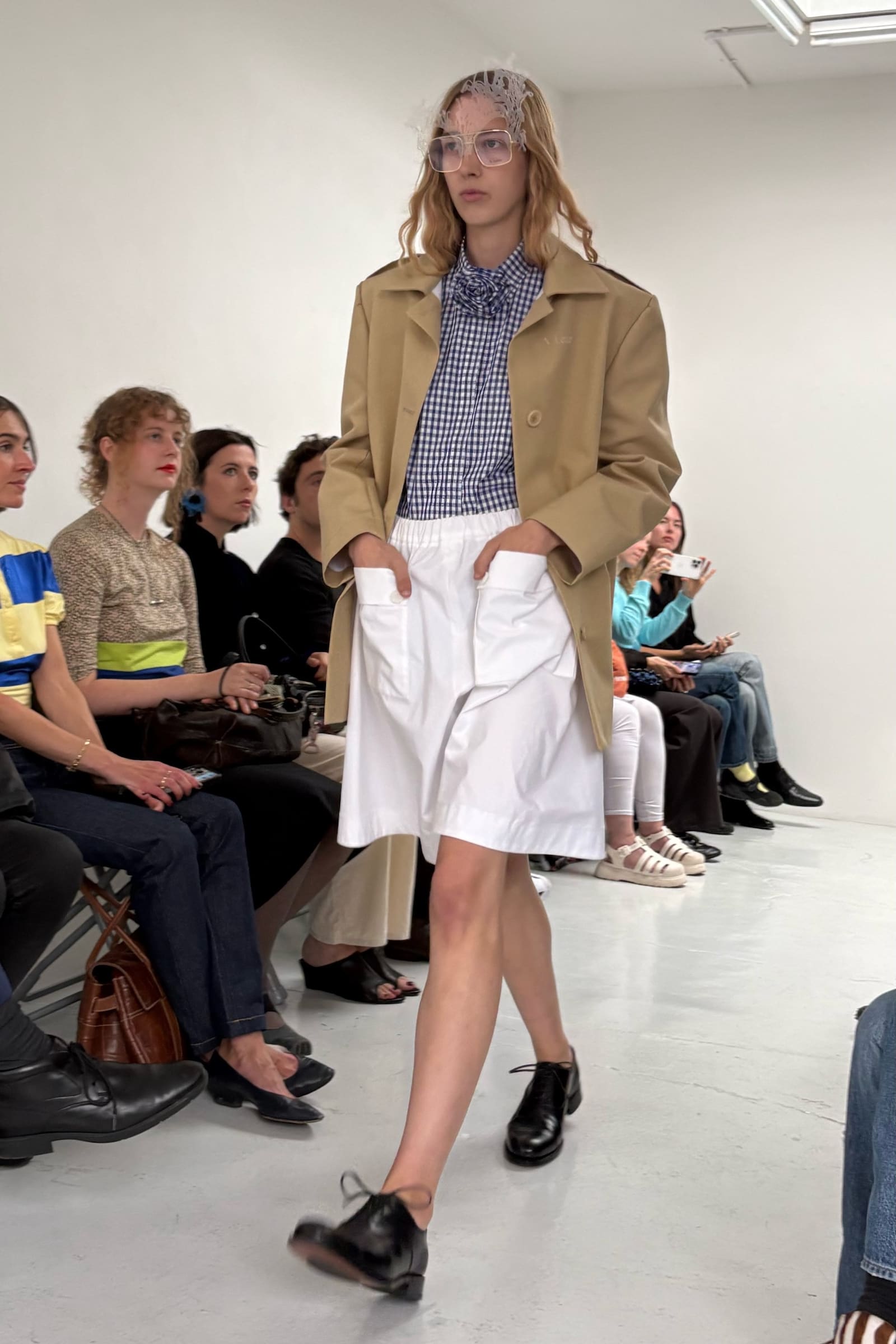
Coomes says luxury doesn’t especially resonate with either of them; they didn’t grow up around it, don’t really consume it. Of course, making clothes deliberately imperfect is one thing but making them beautiful is another. Previously they were effectively making clothes to become images – sculptural things that could sit still and photograph well. “Your output is not image,” he says of a show. “It’s a room full of people looking at your things and people moving in them.”
And in motion, they looked great, crisp and refreshing in odd ways. There is something fashionable in the philosophy of anti-fashion, cliché in the rejection of cliché, but it’s all practical for these two designers, making exactly what they can make at a scale they can manage, and making enough of it to say what they want to say. It’s testament to the duo that the clothes don’t look limited by the restraint, they look better for it.
in HTML format, including tags, to make it appealing and easy to read for Japanese-speaking readers aged 20 to 40 interested in fashion. Organize the content with appropriate headings and subheadings (h1, h2, h3, h4, h5, h6), translating all text, including headings, into Japanese. Retain any existing
tags from
Lead ImageA Letter Spring/Summer 2027Courtesy of A Letter
Freddy Coomes and Matt Empringham aren’t biting off more than they can chew. The creative industries have long fetishised labour and all-nighters, surrounded by rails of unfinished clothes and interns fuelled on Redbull and cigarettes. Coomes and Empringham, who design the young London label A Letter, aren’t very interested in that mythology. Two days before their debut show, Coomes is upstairs at Sarabande, where the brand has its modest studio, talking to me through a webcam; Empringham, the quieter of the pair, is downstairs. “Matt’s in the thick of it,” Coomes says. He makes virtually all of A Letter’s clothes himself. There are no interns and no atelier of hands stitching through the night. But they’ve holidayed this summer and taken weekends off. “We’re really careful around jumping into things too quickly,” says Coomes, “building a big team and not being able to manage a big studio. We’re very happy with it being very personal right now.”
The pair has had plenty of time to figure out how to work together. They met aged 18 on the foundation course at Central Saint Martins, serendipitously paired for their very first project and became friends, effectively designing side by side ever since. During their placement years they briefly split geographically – Coomes interning at Loewe in Paris, Empringham at JW Anderson in London, both then under Jonathan Anderson – but continued making collections together in the time they could carve out around work. Even then their process was fast and with a no-brow approach to material, often beginning with cheap fabric, paper or rubber rather than a finished sketch and resulting in clothes that could look closer to propositions than conventionally resolved garments. That was part of their appeal.
A Letter has been stocked by Dover Street Market since launching in 2025, but the brand is still tiny, still partly supported by freelance work. The designers are figuring out what sort of brand it wants to become. Rather than disguise that with the theatre of overwork, they’ve worked within their limitations. Shown in the tiny, glaringly white Rose Easton gallery, five models cast by Julia Lange take turns walking two rotations, presumably buying time for the others to dash backstage and change. 27 looks walked. That’s your lot – no elaborate light show or army of models, no extravaganza, although the soundtrack was teeth-shatteringly loud. It’s suspiciously sensible for two designers deciding to hop onto the fashion hamster wheel.
The clothes are a little more complicated. A Letter began this season with a pile of archetypal British stuff: a donkey jacket, a pair of vintage men’s chinos, a Ben Sherman gingham shirt, bits from St Michael. “The patterns were lifted basically one for one. Some of them we modernised and made more comfortable. We made them a bit bigger or made a bit smaller, but really the jackets are basically a direct pattern copy,” says Coomes. Tugging, altering and remaking them imperfectly, they carry the sentimental charge of those original pieces, “but there’s a bit of stiffness and there’s a bit of uneasiness,” Coomes says. “It’s not opulent and it’s not chic, sleek.” Hence the underwear with elastic zigzagged into place as if knocked up on somebody’s domestic sewing machine. Transparent dresses trail raw edges. A glossy silk dupion front suddenly gives way to a stripe of workaday calico running down the back. The gingham dress, worn with a matching shirt and fabric rose, picks up a Linda McCartney reference the pair first explored in a shoot over the summer. Then there’s PVC, electrostatic flocking, strange fabric treatments lurking beneath otherwise thoroughly normal-looking clothes. Colours are fresh and exciting.
Coomes says luxury doesn’t especially resonate with either of them; they didn’t grow up around it, don’t really consume it. Of course, making clothes deliberately imperfect is one thing but making them beautiful is another. Previously they were effectively making clothes to become images – sculptural things that could sit still and photograph well. “Your output is not image,” he says of a show. “It’s a room full of people looking at your things and people moving in them.”
And in motion, they looked great, crisp and refreshing in odd ways. There is something fashionable in the philosophy of anti-fashion, cliché in the rejection of cliché, but it’s all practical for these two designers, making exactly what they can make at a scale they can manage, and making enough of it to say what they want to say. It’s testament to the duo that the clothes don’t look limited by the restraint, they look better for it.
and integrate them seamlessly into the new content without adding new tags. Ensure the new content is fashion-related, written entirely in Japanese, and approximately 1500 words. Conclude with a “結論” section and a well-formatted “よくある質問” section. Avoid including an introduction or a note explaining the process.