Rewrite
Lead ImageCraig Green Spring/Summer 2026Courtesy of Craig Green
“It started with the Beatles,” said Craig Green, of his Spring/Summer 2026. Which was unexpected. I probably made a face, because I hate The Beatles. “Not so much their style, or really … them,” he added. “But that they achieved something that was almost otherworldly, inhuman. Two albums a year, for ten years. That potential in youth.”
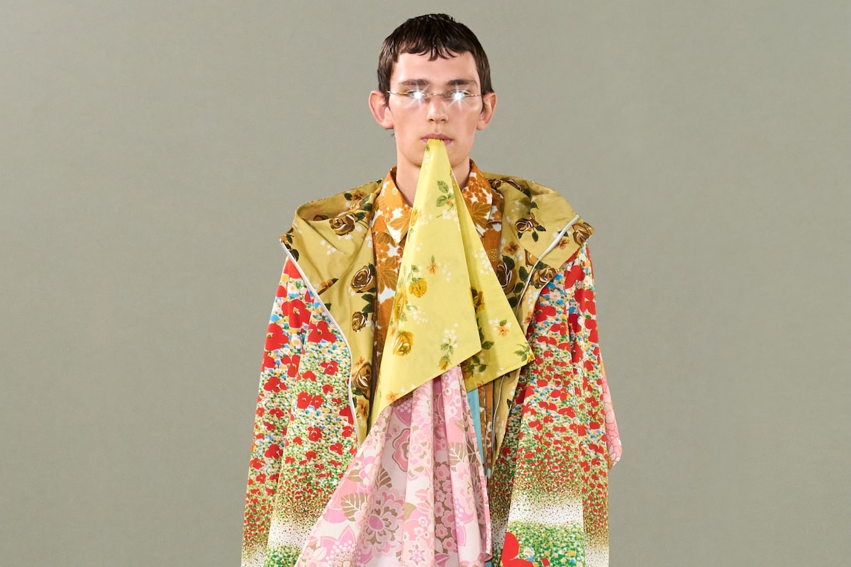
So maybe, that’s where the tiny, multicoloured, psychedelic florals at the end came from? “We were thinking it’s quite weird that you would share bedsheets with someone,” Green said, without batting an eyelid. “But you wouldn’t share underwear. Even though most people sleep naked.”
Okay. Where did they come from? I meant, ideologically. Green took it literally. “Most of them are from vintage stores. Save The Children, some from Vinted. We thought they were disgusting things when they came – they smelled. Imagine how many people had been in those sheets. But that kind of aesthetic was normal, and across classes. That celebration of colour. It was about aesthetics that I find challenging, or gross, or terrifying. There was a romantic feeling, which isn’t really in my interests. But it made sense.” Well, there’s a romance between the sheets, right?
Then, imagine what they were listening to, too. “I loved the idea when people would have records, and would play them backwards, to find hidden messages. That seems so alien now, to have something that you’re trying to find even more entertainment in, just one thing.”
Back to colour. “Harvest gold, I was obsessed with,” Green said. It’s the name given to that specific, slightly septic shade of yellow that, juxtaposed with brown, burnt orange, and avocado green, shaped the aesthetic of Britain in the 1970s. Green’s mother had, appropriately enough, a green bathroom suite. But Green wanted his room yellow, because he’d read about the odd fact that if you paint a room yellow, you’re likely to have more arguments in it, and your baby will cry more. Have you ever read The Yellow Wallpaper? It’s an 1892 proto-feminist novella by Charlotte Perkins Gilman, of a woman apparently driven insane by jaundiced wall-coverings, but actually by the restrictions of society around her, closed minds and weighted expectations.

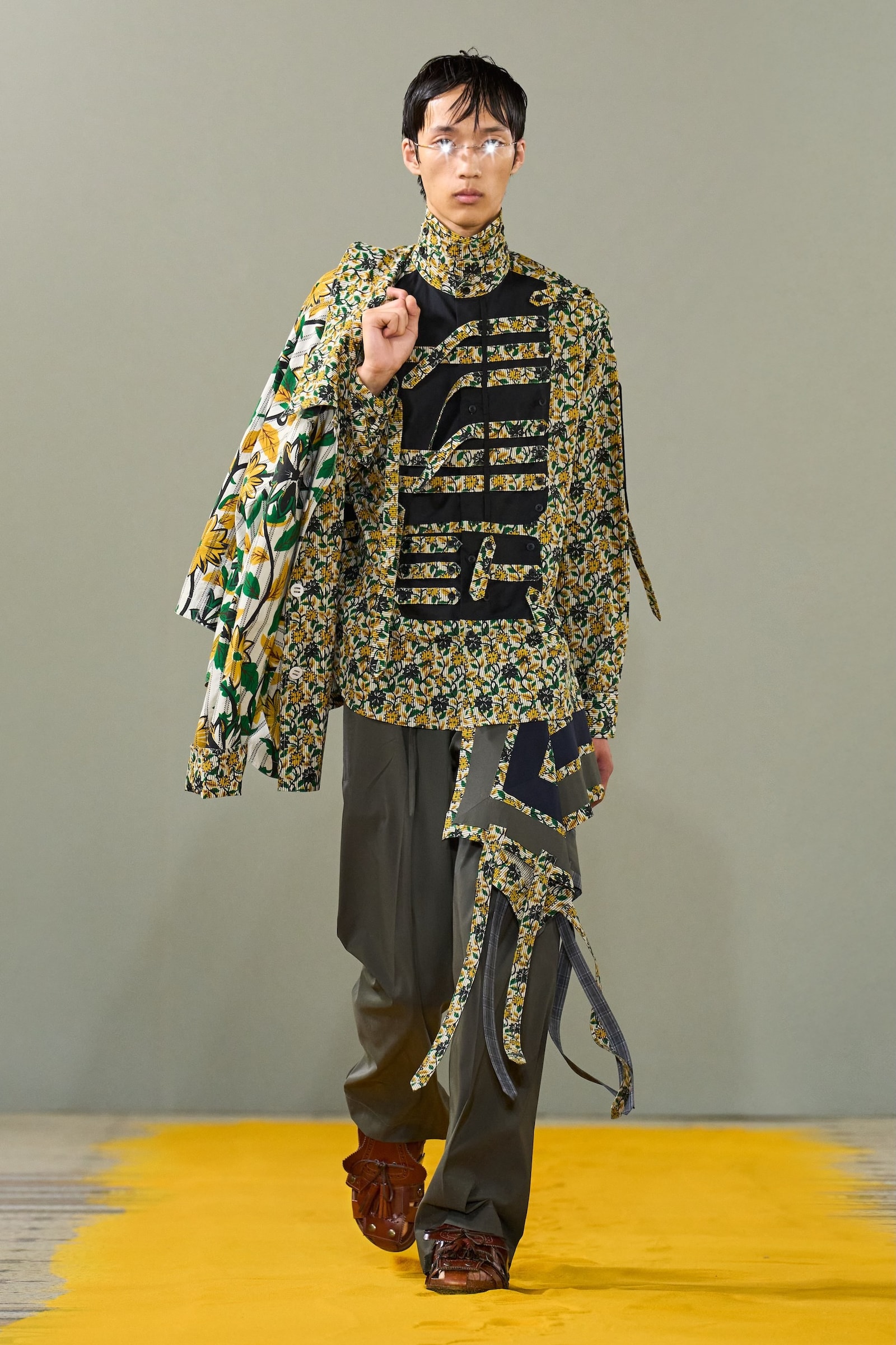
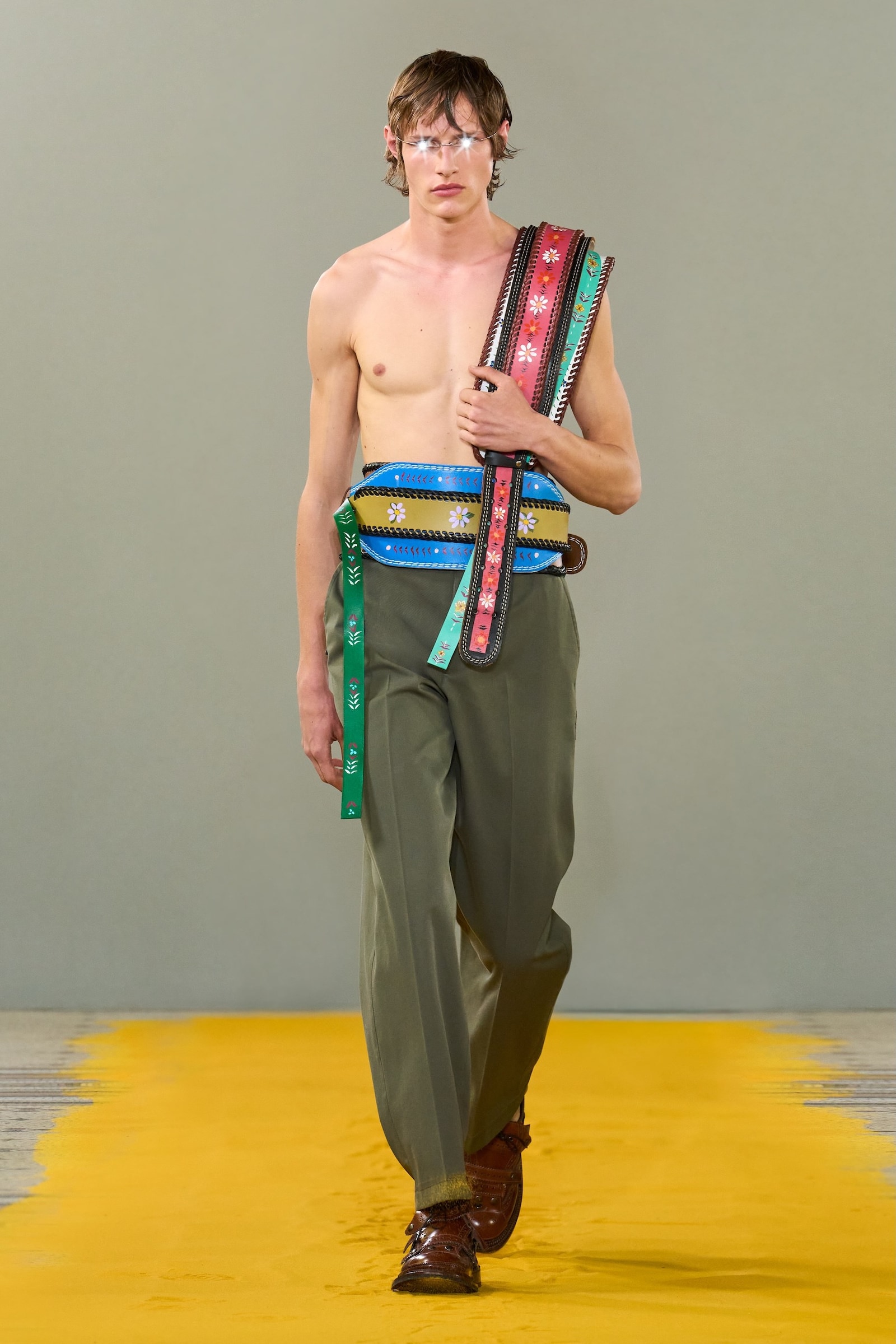
Green’s models’ eyes gleamed like androids. It seemed high-tech but came via the teeny-tiny flickering bulbs that illuminate dollhouses, attached to cheap wire tiara headbands and worn like glasses. “That was the potential of youth, again. The fearlessness,” Green said. “I like that they looked ‘inhuman’ in a way, looking to the future.” A few seemed to be barfing out lengths of fabric from their mouths, inspired by images of Matthew Barney’s Cremaster Cycle and old photos of con artist exorcisms. “But it was also like biting a bedsheet. Sensory, finding feeling.”
Why should I do the heavy lifting when Craig Green’s glorious stream of consciousness unravelling of his multilayered inspirations is so incredible, so utterly unexpected and unlike anything else? In a small room in the Conservatoire National des Arts et Métiers – a French grande école dedicated to craft, which felt entirely appropriate – Green showed this extraordinary collection of colliding inspirations, synchronised thoughts, and exceptional feeling.
He’s made something of a signature out of that – of bizarre influences that he somehow alchemises into mesmerising and mind-boggling fashion shows. On paper, they’re arcane in the extreme – rarely clothes, always other. But somehow, instead of coming up with deranged costume, Green boils it down into a jumper, a jacket, a shirt. That’s not a criticism, it’s the highest point of praise. To take all that complex thought and distil it into something recognisable, on the one hand, yet never quite what we’ve seen before, is the sign of a true design great. This season, there were ratted knits of overlaid textures, tufted bits of wool growing out of chests and arms. There were beautiful belts, hand-painted with florals like Romani vardos but actually drawn from those musty old bedsheets.

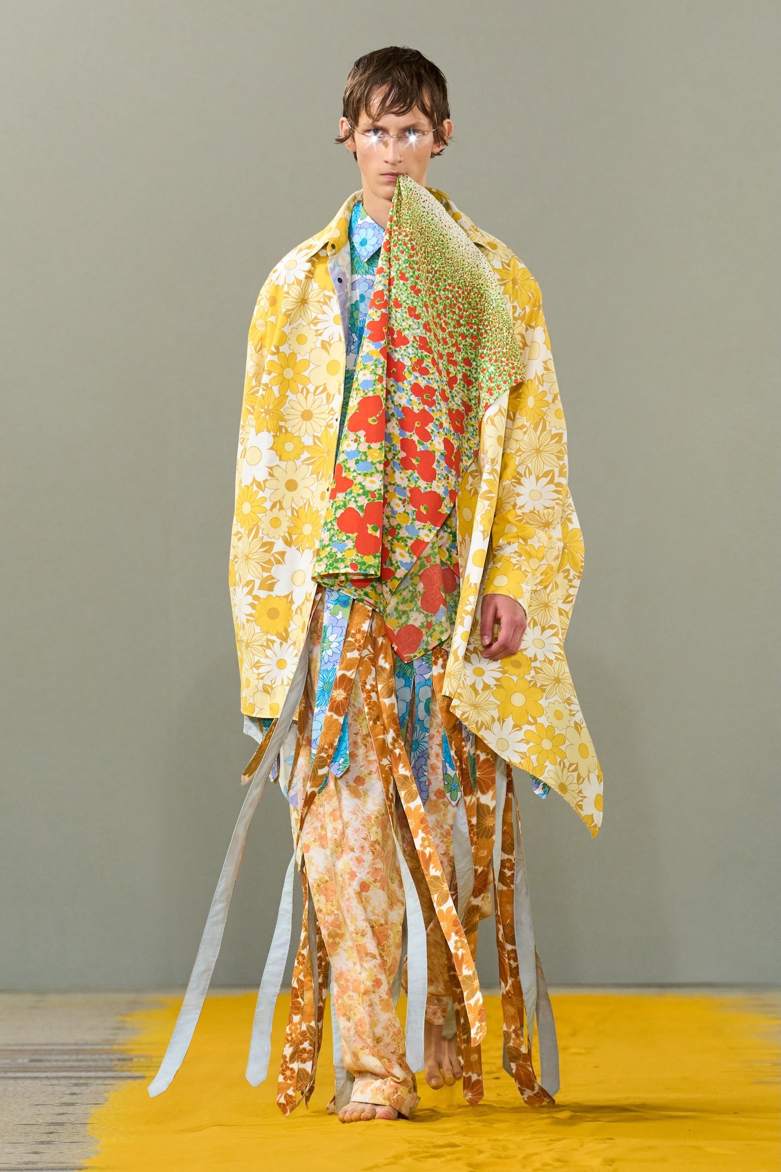
And, at the end, there were extraordinary technicolour dreamcoats, explosions of colour and energy in those multilayered cheap and cheerful near-Lilly Pulitzer psychedelic prints. “Trippy intensity” was his word for them. And then some. Those bold coats managed to be both totally unique, singular to his skill and aesthetic, yet also a neat summary of the mood of optimism and positivity that had infected this entire bout of menswear shows. Well, a summary that then blew everyone else out of the water. This was a masterful, powerful, memorable fashion show. Inspired, and inspiring.
in HTML format, including tags, to make it appealing and easy to read for Japanese-speaking readers aged 20 to 40 interested in fashion. Organize the content with appropriate headings and subheadings (h1, h2, h3, h4, h5, h6), translating all text, including headings, into Japanese. Retain any existing
tags from
Lead ImageCraig Green Spring/Summer 2026Courtesy of Craig Green
“It started with the Beatles,” said Craig Green, of his Spring/Summer 2026. Which was unexpected. I probably made a face, because I hate The Beatles. “Not so much their style, or really … them,” he added. “But that they achieved something that was almost otherworldly, inhuman. Two albums a year, for ten years. That potential in youth.”
So maybe, that’s where the tiny, multicoloured, psychedelic florals at the end came from? “We were thinking it’s quite weird that you would share bedsheets with someone,” Green said, without batting an eyelid. “But you wouldn’t share underwear. Even though most people sleep naked.”
Okay. Where did they come from? I meant, ideologically. Green took it literally. “Most of them are from vintage stores. Save The Children, some from Vinted. We thought they were disgusting things when they came – they smelled. Imagine how many people had been in those sheets. But that kind of aesthetic was normal, and across classes. That celebration of colour. It was about aesthetics that I find challenging, or gross, or terrifying. There was a romantic feeling, which isn’t really in my interests. But it made sense.” Well, there’s a romance between the sheets, right?
Then, imagine what they were listening to, too. “I loved the idea when people would have records, and would play them backwards, to find hidden messages. That seems so alien now, to have something that you’re trying to find even more entertainment in, just one thing.”
Back to colour. “Harvest gold, I was obsessed with,” Green said. It’s the name given to that specific, slightly septic shade of yellow that, juxtaposed with brown, burnt orange, and avocado green, shaped the aesthetic of Britain in the 1970s. Green’s mother had, appropriately enough, a green bathroom suite. But Green wanted his room yellow, because he’d read about the odd fact that if you paint a room yellow, you’re likely to have more arguments in it, and your baby will cry more. Have you ever read The Yellow Wallpaper? It’s an 1892 proto-feminist novella by Charlotte Perkins Gilman, of a woman apparently driven insane by jaundiced wall-coverings, but actually by the restrictions of society around her, closed minds and weighted expectations.
Green’s models’ eyes gleamed like androids. It seemed high-tech but came via the teeny-tiny flickering bulbs that illuminate dollhouses, attached to cheap wire tiara headbands and worn like glasses. “That was the potential of youth, again. The fearlessness,” Green said. “I like that they looked ‘inhuman’ in a way, looking to the future.” A few seemed to be barfing out lengths of fabric from their mouths, inspired by images of Matthew Barney’s Cremaster Cycle and old photos of con artist exorcisms. “But it was also like biting a bedsheet. Sensory, finding feeling.”
Why should I do the heavy lifting when Craig Green’s glorious stream of consciousness unravelling of his multilayered inspirations is so incredible, so utterly unexpected and unlike anything else? In a small room in the Conservatoire National des Arts et Métiers – a French grande école dedicated to craft, which felt entirely appropriate – Green showed this extraordinary collection of colliding inspirations, synchronised thoughts, and exceptional feeling.
He’s made something of a signature out of that – of bizarre influences that he somehow alchemises into mesmerising and mind-boggling fashion shows. On paper, they’re arcane in the extreme – rarely clothes, always other. But somehow, instead of coming up with deranged costume, Green boils it down into a jumper, a jacket, a shirt. That’s not a criticism, it’s the highest point of praise. To take all that complex thought and distil it into something recognisable, on the one hand, yet never quite what we’ve seen before, is the sign of a true design great. This season, there were ratted knits of overlaid textures, tufted bits of wool growing out of chests and arms. There were beautiful belts, hand-painted with florals like Romani vardos but actually drawn from those musty old bedsheets.
And, at the end, there were extraordinary technicolour dreamcoats, explosions of colour and energy in those multilayered cheap and cheerful near-Lilly Pulitzer psychedelic prints. “Trippy intensity” was his word for them. And then some. Those bold coats managed to be both totally unique, singular to his skill and aesthetic, yet also a neat summary of the mood of optimism and positivity that had infected this entire bout of menswear shows. Well, a summary that then blew everyone else out of the water. This was a masterful, powerful, memorable fashion show. Inspired, and inspiring.
and integrate them seamlessly into the new content without adding new tags. Ensure the new content is fashion-related, written entirely in Japanese, and approximately 1500 words. Conclude with a “結論” section and a well-formatted “よくある質問” section. Avoid including an introduction or a note explaining the process.