Rewrite
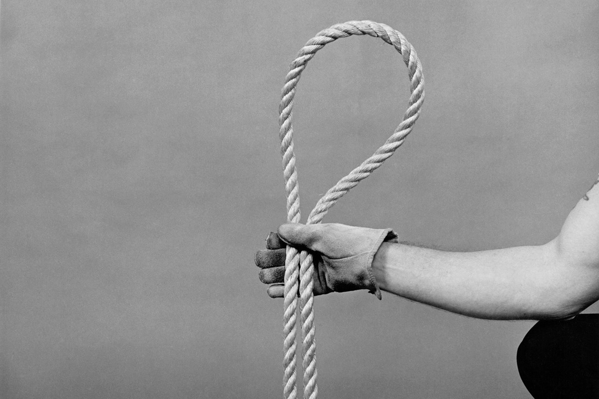
Lead ImageNooseEvidence by Larry Sultan and Mike Mandel
Evidence opens with a photograph of four footprints on a wet floor. The closer set appears normal, with the left foot on the left and the right foot on the right. The second pair, however, one step ahead, appear inverted, with the left foot now on the right and the right foot on the left. This image was chosen, according to Mike Mandel – one half of the duo behind the book – to let the viewer know that what follows is a journey “going wrong”.
It was 1977 when Mike and the late Larry Sultan first released Evidence and its spreads of ‘vernacular images’ sifted from the archives of different government agencies, corporate head offices and research institutes in California. Around the same time, new ideas about photography were rubbing up against the old in the art world; Richard Prince began creating his controversial ‘rephotographed’ shots from advertising displays in 1977, and a buzzy New York exhibition, Pictures, put together the work of five artists – the ‘Pictures Generation’ – who were “predominantly inspired by, or used images culled from newspapers, advertisements, film and television”. It was also the year Susan Sontag published On Photography, her provocative collection of essays about the evolving art form.
Sontag was perturbed by the direction some artists were taking photography in, questioning the soul of their work and, like many before her and many since, what did and did not constitute art. Mike and Larry may not have been the people Sontag was talking about, but in piecing together this “poem” of images, as Mike calls it, the pair very much represented part of a new paradigm of the medium she rejected. Half a century later, Evidence is not only considered a vital flashpoint in art history, but some go as far as to call it one of the most important photography books ever made. Back in print nearly 50 years after its initial publication, DAP has now republished a new edition of the cult book.
“There were really no other artist books that had been made using vernacular imagery,” Mike says today. “The only other artists using vernacular imagery were translating photography, like Warhol, or Rauschenberg would take a photograph and turn it into a silkscreen or a painting. We were the first ones to recognise that all you really had to do was find the pictures and figure out what kind of pictures had the qualities that would allow you as a viewer to be engaged enough to want to try and figure them out. They weren’t trying to teach you anything. They weren’t didactic.”
Mike and Larry began working with one another in 1973, meeting on a graduate programme at the San Francisco Art Institute’s photography school. Disillusioned by the traditional nature of their course and the Beat culture of the city, the pair became more interested in making art that appropriated the language of corporate advertising. “It’s an awful thing to admit, but the advertisers were the visionaries of our time,” Larry once said. “They gave us notions of who we should become. Our myths of heaven and hell.“
Working under a tongue-in-cheek, pseudo-corporate name – Clatworthy Colorvues – first, they took photographs of billboards; they then began to create billboards of their own. Clatworthy Colorvues’s best-known billboard, Oranges on Fire (1973), takes a familiar format and evolves it into something absurd yet still capable of blending into the mosaic of media and marketing on display in urban America. On this billboard, outstretched hands present the titular burning oranges as if they were something one might naturally expect to be sold and handed over. “Once we started working together we realised we could do anything together,” Mike says.
In 1975, the pair were awarded a grant from the National Endowment for the Arts to create a book of images scoured from the archives of those organisations engaged in research, social policy and so on. Soon after, they convinced the curator of photography at the San Francisco Museum of Modern Art to stage a corresponding show with the images they intended to find. They started with NASA. “We thought there would be something interesting there because we’ve seen all the pictures of the guys who went to the moon,” says Mike. Across the next two years, the pair found their way into the archives of laboratories, police stations, state departments, and offices of corporations like Lockheed, Bechtel and Teledyne (a comprehensive list of each one can be found at the book’s beginning). Without captions, dates or locations for the images, the list provides as much context as Mike and Larry felt necessary.
Convinced by the government-headed letter paper and the chance to be included in an exhibition that promoted the good work of these operations, the extensive list of places that granted access is remarkable. “The organisations that had government contracts to build space vehicles or to build weaponry weren’t letting us see what they were doing at that time though,” says Mike. This meant that everything they were looking at was limited to the 60s, with every image shot on the large 4×5 inch format that preceded 35 mm cameras. “4×5 had so much quality, so much detail,” he says.
“It was clear to us at that time that these organisations were not giving us the wonderful future that they promised” – Mike Mandel
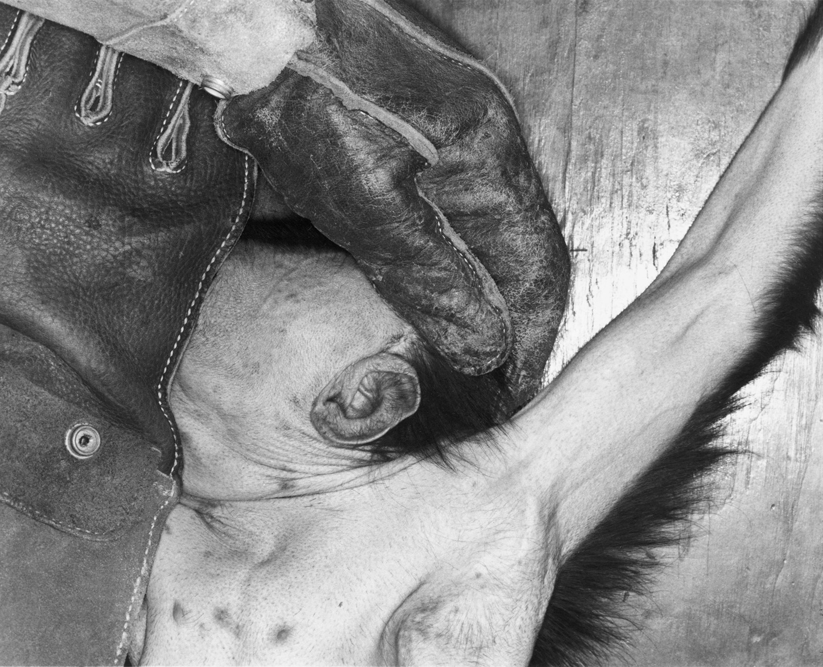
In a more abstract sense, using images from the past, of environments and experiments that were largely concerned with exploring the future, Evidence also presents a twisted vision of time. Here was post-World War II America imagining new ways of living and, invariably, new ways of killing. But among the book’s darker moments, there’s plenty of surrealism and humour too; a horse’s hoof is weighed on a scale, a fully-clad astronaut seemingly does press-ups. “The facing page I really like is the hospital beds on the grass and the trees that are inside the plastic rooms. What shouldn’t be outside is outside, what shouldn’t be inside is inside. That kind of dynamic quality of the pictures informing each other is what the book is more about for me.”
I ask Mike how he feels about the content of the images now, in an era we call late-stage capitalism, when men in suits, shirts and ties were sowing so many of the seeds that bloomed into our current reality. “Things haven’t taken too much of a left or right-hand turn, I guess,” he laughs. “There are more efficient ways to kill people, and to surveil people, to gather information about who we are, to be able to enable us to spend our money in various ways. It’s not as if the story didn’t pan out.”
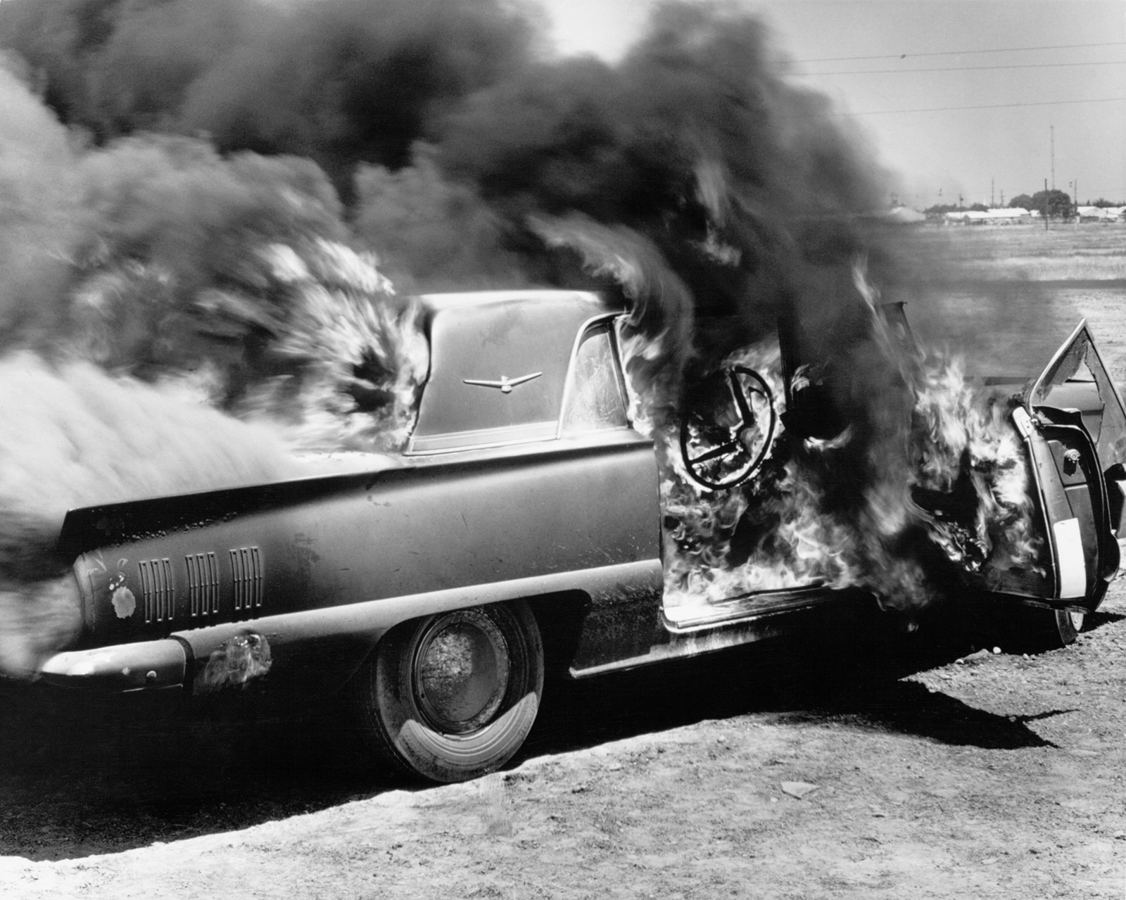
The book’s small, controlled explosions are perhaps the most literal representations of the violence and subjugation these experiments imply. But a distrust of these men – for Mike and Larry, who grew up through the Vietnam War – is present in the smallest details. As a kid growing up in California, Mike would visit Disneyland. “I’d go to Tomorrowland. The Monsanto Company had its own little exhibit [the Monsanto House of the Future], and it had all these amazing things that were gonna happen – you could just touch a picture of some food, and it would be prepared for you.” Monsanto also created Agent Orange, the chemical used as part of Operation Ranch Hand, the military’s herbicidal warfare program. “It was clear to us at that time that these organisations were not giving us the wonderful future that they promised,” says Mike. “We knew these pictures of these strange translations of the landscape, or these clinical, objectifying images were a dystopian opportunity for us to create that message.”
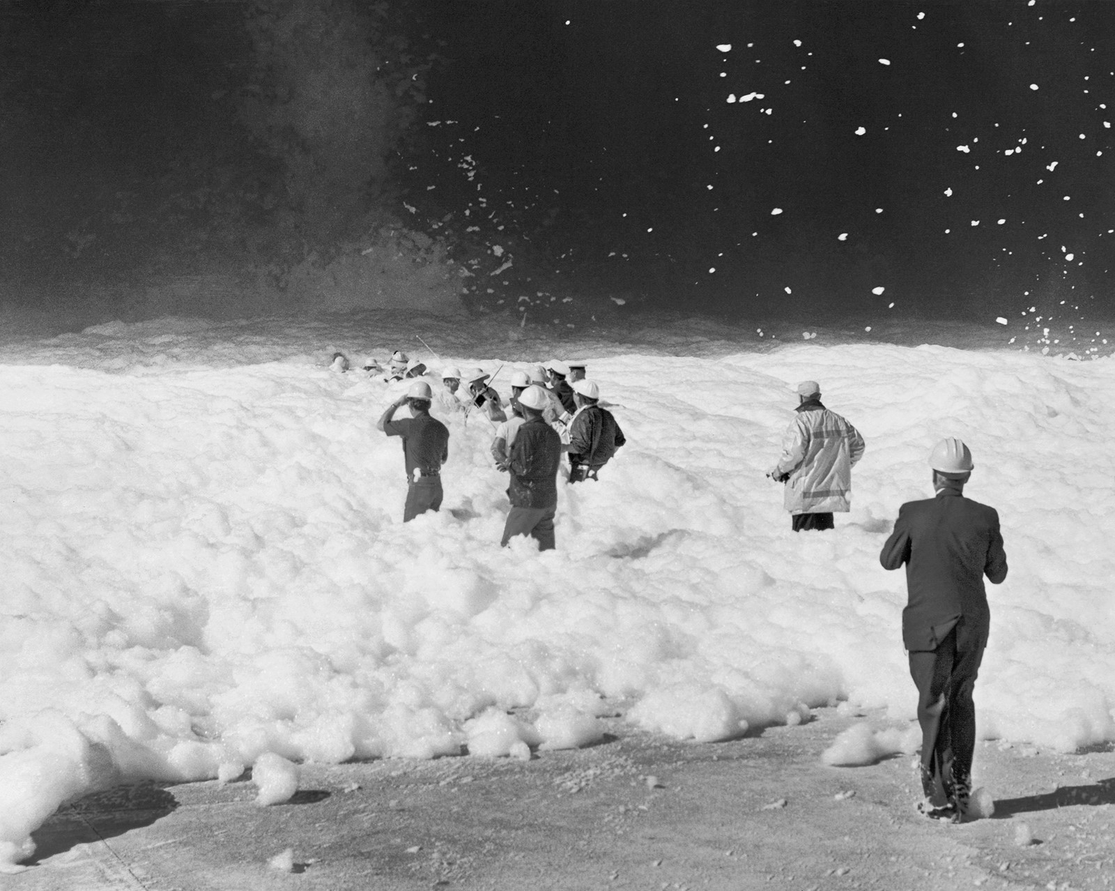
From the book’s more “interior, clinical” scenes, as Mike puts it, to the more exaggerated moments – sprays and explosions, plumes of smoke and foam – by the time we reach the book’s end, we land on a more reflective moment: a picture of rocks encased in wire. “It’s sort of like a metaphor really for the whole book,” Mike says. “It’s saying these rocks were someone else, humans put them in position to do something, and they put all this wire around them so they can’t get away. It’s this human control over nature that this whole book is about. That’s it, that’s the end of the story.”
2024 is a curious moment to consider vernacular photography and reflect on its once-outlier status. Perhaps the debate is not as heated as it was in 1977 – when the photographers and critics were part of a much smaller, more intimate community – but conversations around AI and what that means for the craft represent another point of convergence. For Mike, republishing the book now was simply an opportunity to present the images in sharper detail and in some cases, less cropped than before.
“I think that language of how the pictures relate to each other is why the book is still in print, and why people who care about photography think it’s worthwhile and useful,” Mike adds. “I’m not going to be around that much longer, but maybe this book will outlive me.”
Evidence by Larry Sultan and Mike Mandel is published by DAP, and is out now.
in HTML format, including tags, to make it appealing and easy to read for Japanese-speaking readers aged 20 to 40 interested in fashion. Organize the content with appropriate headings and subheadings (h1, h2, h3, h4, h5, h6), translating all text, including headings, into Japanese. Retain any existing
tags from
Lead ImageNooseEvidence by Larry Sultan and Mike Mandel
Evidence opens with a photograph of four footprints on a wet floor. The closer set appears normal, with the left foot on the left and the right foot on the right. The second pair, however, one step ahead, appear inverted, with the left foot now on the right and the right foot on the left. This image was chosen, according to Mike Mandel – one half of the duo behind the book – to let the viewer know that what follows is a journey “going wrong”.
It was 1977 when Mike and the late Larry Sultan first released Evidence and its spreads of ‘vernacular images’ sifted from the archives of different government agencies, corporate head offices and research institutes in California. Around the same time, new ideas about photography were rubbing up against the old in the art world; Richard Prince began creating his controversial ‘rephotographed’ shots from advertising displays in 1977, and a buzzy New York exhibition, Pictures, put together the work of five artists – the ‘Pictures Generation’ – who were “predominantly inspired by, or used images culled from newspapers, advertisements, film and television”. It was also the year Susan Sontag published On Photography, her provocative collection of essays about the evolving art form.
Sontag was perturbed by the direction some artists were taking photography in, questioning the soul of their work and, like many before her and many since, what did and did not constitute art. Mike and Larry may not have been the people Sontag was talking about, but in piecing together this “poem” of images, as Mike calls it, the pair very much represented part of a new paradigm of the medium she rejected. Half a century later, Evidence is not only considered a vital flashpoint in art history, but some go as far as to call it one of the most important photography books ever made. Back in print nearly 50 years after its initial publication, DAP has now republished a new edition of the cult book.
“There were really no other artist books that had been made using vernacular imagery,” Mike says today. “The only other artists using vernacular imagery were translating photography, like Warhol, or Rauschenberg would take a photograph and turn it into a silkscreen or a painting. We were the first ones to recognise that all you really had to do was find the pictures and figure out what kind of pictures had the qualities that would allow you as a viewer to be engaged enough to want to try and figure them out. They weren’t trying to teach you anything. They weren’t didactic.”
Mike and Larry began working with one another in 1973, meeting on a graduate programme at the San Francisco Art Institute’s photography school. Disillusioned by the traditional nature of their course and the Beat culture of the city, the pair became more interested in making art that appropriated the language of corporate advertising. “It’s an awful thing to admit, but the advertisers were the visionaries of our time,” Larry once said. “They gave us notions of who we should become. Our myths of heaven and hell.“

Working under a tongue-in-cheek, pseudo-corporate name – Clatworthy Colorvues – first, they took photographs of billboards; they then began to create billboards of their own. Clatworthy Colorvues’s best-known billboard, Oranges on Fire (1973), takes a familiar format and evolves it into something absurd yet still capable of blending into the mosaic of media and marketing on display in urban America. On this billboard, outstretched hands present the titular burning oranges as if they were something one might naturally expect to be sold and handed over. “Once we started working together we realised we could do anything together,” Mike says.
In 1975, the pair were awarded a grant from the National Endowment for the Arts to create a book of images scoured from the archives of those organisations engaged in research, social policy and so on. Soon after, they convinced the curator of photography at the San Francisco Museum of Modern Art to stage a corresponding show with the images they intended to find. They started with NASA. “We thought there would be something interesting there because we’ve seen all the pictures of the guys who went to the moon,” says Mike. Across the next two years, the pair found their way into the archives of laboratories, police stations, state departments, and offices of corporations like Lockheed, Bechtel and Teledyne (a comprehensive list of each one can be found at the book’s beginning). Without captions, dates or locations for the images, the list provides as much context as Mike and Larry felt necessary.
Convinced by the government-headed letter paper and the chance to be included in an exhibition that promoted the good work of these operations, the extensive list of places that granted access is remarkable. “The organisations that had government contracts to build space vehicles or to build weaponry weren’t letting us see what they were doing at that time though,” says Mike. This meant that everything they were looking at was limited to the 60s, with every image shot on the large 4×5 inch format that preceded 35 mm cameras. “4×5 had so much quality, so much detail,” he says.
“It was clear to us at that time that these organisations were not giving us the wonderful future that they promised” – Mike Mandel

In a more abstract sense, using images from the past, of environments and experiments that were largely concerned with exploring the future, Evidence also presents a twisted vision of time. Here was post-World War II America imagining new ways of living and, invariably, new ways of killing. But among the book’s darker moments, there’s plenty of surrealism and humour too; a horse’s hoof is weighed on a scale, a fully-clad astronaut seemingly does press-ups. “The facing page I really like is the hospital beds on the grass and the trees that are inside the plastic rooms. What shouldn’t be outside is outside, what shouldn’t be inside is inside. That kind of dynamic quality of the pictures informing each other is what the book is more about for me.”
I ask Mike how he feels about the content of the images now, in an era we call late-stage capitalism, when men in suits, shirts and ties were sowing so many of the seeds that bloomed into our current reality. “Things haven’t taken too much of a left or right-hand turn, I guess,” he laughs. “There are more efficient ways to kill people, and to surveil people, to gather information about who we are, to be able to enable us to spend our money in various ways. It’s not as if the story didn’t pan out.”
The book’s small, controlled explosions are perhaps the most literal representations of the violence and subjugation these experiments imply. But a distrust of these men – for Mike and Larry, who grew up through the Vietnam War – is present in the smallest details. As a kid growing up in California, Mike would visit Disneyland. “I’d go to Tomorrowland. The Monsanto Company had its own little exhibit [the Monsanto House of the Future], and it had all these amazing things that were gonna happen – you could just touch a picture of some food, and it would be prepared for you.” Monsanto also created Agent Orange, the chemical used as part of Operation Ranch Hand, the military’s herbicidal warfare program. “It was clear to us at that time that these organisations were not giving us the wonderful future that they promised,” says Mike. “We knew these pictures of these strange translations of the landscape, or these clinical, objectifying images were a dystopian opportunity for us to create that message.”

From the book’s more “interior, clinical” scenes, as Mike puts it, to the more exaggerated moments – sprays and explosions, plumes of smoke and foam – by the time we reach the book’s end, we land on a more reflective moment: a picture of rocks encased in wire. “It’s sort of like a metaphor really for the whole book,” Mike says. “It’s saying these rocks were someone else, humans put them in position to do something, and they put all this wire around them so they can’t get away. It’s this human control over nature that this whole book is about. That’s it, that’s the end of the story.”
2024 is a curious moment to consider vernacular photography and reflect on its once-outlier status. Perhaps the debate is not as heated as it was in 1977 – when the photographers and critics were part of a much smaller, more intimate community – but conversations around AI and what that means for the craft represent another point of convergence. For Mike, republishing the book now was simply an opportunity to present the images in sharper detail and in some cases, less cropped than before.
“I think that language of how the pictures relate to each other is why the book is still in print, and why people who care about photography think it’s worthwhile and useful,” Mike adds. “I’m not going to be around that much longer, but maybe this book will outlive me.”
Evidence by Larry Sultan and Mike Mandel is published by DAP, and is out now.
and integrate them seamlessly into the new content without adding new tags. Ensure the new content is fashion-related, written entirely in Japanese, and approximately 1500 words. Conclude with a “結論” section and a well-formatted “よくある質問” section. Avoid including an introduction or a note explaining the process.

